Build a Segmented Control using HTML + CSS
Segmented Control is quite popular in Mobile, this is how it looks in iOS & Android. Considering it’s popularity, there is a wide adoption in web as well.
Today we will be building a segmented control to toggle colour schemes on our website, rather recreate the one found on the footer of Apple Developer website.

Segmented Control in Apple Developer website (dark mode)

Segmented Control in Apple Developer website (light mode)
Choosing the right UI element
I am writing this article as I am building it, so hopefully it will be simple to understand & will cover most of the grounds.
From what we already know, the right UI for this component would be a radio input as we can select only one segment at a time. So, let’s try to add 3 radio inputs to an index.html
<!DOCTYPE html>
<html lang="en">

<body>
  <input id="light-color-scheme-radio" type="radio">
  <label for="light-color-scheme-radio">Light</label>

  <input id="dark-color-scheme-radio" type="radio">
  <label for="dark-color-scheme-radio">Dark</label>

  <input id="auto-color-scheme-radio" type="radio">
  <label for="auto-color-scheme-radio">Auto</label>
</body>

</html>
index.html
Output
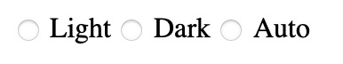
Radio Buttons chosen for Segmented Controls
Styling Decisions
Looks like the horizontal alignment is fine, we need to change few things:
hide the
radiocircle
change background & foreground colour of selected
input
Hide the radio circle
Let’s add an index.css, we would need to wrap the radio buttons on a div , then change the display property of div.input
<head>
  <link rel="stylesheet" href="index.css">
</head>

<body>
  <div class="color-scheme-segment-control">
    <input id="light-color-scheme-segment" type="radio">
    <label for="light-color-scheme-segment">Light</label>

    <input id="dark-color-scheme-segment" type="radio">
    <label for="dark-color-scheme-segment">Dark</label>

    <input id="auto-color-scheme-segment" type="radio">
    <label for="auto-color-scheme-segment">Auto</label>
  </div>
</body>
index.html
.color-scheme-segment-control input {
  display: none;
}
index.css
Output
Radio buttons with radio circle hidden
Change background & foreground colour of selected input
This is tricky, whenever a radio input is selected, we need to somehow change the style of its corresponding label
From w3schools CSS Selector Reference, looks like [element + element] (as referenced here) might do the job, let’s try by setting first input as checked
<div class="color-scheme-segment-control">
    <input id="light-color-scheme-segment" type="radio" checked>
		<label for="light-color-scheme-segment">Light</label>
		...
</div>
index.html
#light-color-scheme-segment:checked + label {
  background-color: blue;
}
index.css
Output
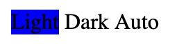
Radio buttons with a selected state
okay, it works, but that means we have to duplicate the same style for other inputs as well. Is there a way to combine the style for all the inputs ? May be if we gave them all the same name & somehow apply style to that name instead 🤔
From w3schools CSS Selector Reference, looks like [*attribute*~=*value*] (as referenced here) might do the job, let’s try (we need to check if it works upon selection & deselection also)
<div class="color-scheme-segment-control">
    <input id="light-color-scheme-segment" name="color-scheme-segment-input" type="radio" checked>
    <label for="light-color-scheme-segment">Light</label>

    <input id="dark-color-scheme-segment" name="color-scheme-segment-input" type="radio">
    <label for="dark-color-scheme-segment">Dark</label>

    <input id="auto-color-scheme-segment" name="color-scheme-segment-input" type="radio">
    <label for="auto-color-scheme-segment">Auto</label>
</div>
index.html
[name~="color-scheme-segment-input"]:checked + label {
  background-color: blue;
}
index.css
Output
Radio buttons interaction with selected & unselected state
Awesome 🥳 it works, even on selection & deselection
From here on, it should be easy for us to add other styles like foreground colour on selection.
Final Styling
1) Outer div should place the inputs & labels in centre
.color-scheme-segment-control {
  display: inline-flex;
  justify-content: center;
  align-content: center;
}
index.css
2) Outer div should have some padding , border & capsule-button like look (we can achieve it by giving a really big corner radius)
.color-scheme-segment-control {
  padding: 1px;
  border: solid 1px #306FDB;
  /* To make it look like a capsule */
  border-radius: 1000px;
}
index.css
3) labels should have some padding (more on horizontal), default (unselected) foreground colour, reduced font size & capsule-button like look
.color-scheme-segment-control label {
  padding: 3px 8px;
  color: #306FDB;
  font-size: 0.75rem;
  /* To make it look like a capsule */
  border-radius: 1000px;
}
index.css
4) labels should have a selected foreground & background colour
[name~="color-scheme-segment-input"]:checked+label {
  color: white;
  background-color: #306FDB;
}
index.css
That’s it, this is how our final code will looks like
<!DOCTYPE html>
<html lang="en">

<head>
  <link rel="stylesheet" href="index.css">
</head>

<body>
  <h1>Segment Control Demo</h1>
  <div class="color-scheme-segment-control">
    <input id="light-color-scheme-segment" name="color-scheme-segment-input" type="radio" checked>
    <label for="light-color-scheme-segment">Light</label>

    <input id="dark-color-scheme-segment" name="color-scheme-segment-input" type="radio">
    <label for="dark-color-scheme-segment">Dark</label>

    <input id="auto-color-scheme-segment" name="color-scheme-segment-input" type="radio">
    <label for="auto-color-scheme-segment">Auto</label>
  </div>
</body>

</html>
index.html
.color-scheme-segment-control {
  display: inline-flex;
  justify-content: center;
  align-content: center;
  padding: 1px;
  border: solid 1px #306FDB;
  /* To make it look like a capsule */
  border-radius: 1000px;
}

.color-scheme-segment-control input {
  display: none;
}

.color-scheme-segment-control label {
  padding: 3px 8px;
  color: #306FDB;
  font-size: 0.75rem;
  /* To make it look like a capsule */
  border-radius: 1000px;
}

[name~="color-scheme-segment-input"]:checked+label {
  color: white;
  background-color: #306FDB;
}
index.css
SPONSOR

ARCtic Conference 2026
Feb 10-12, 2026 at Theatre Rio, Oulu, Finland 🇫🇮 — The World's Coolest Apple Developers Conference! One day of workshops, two days of tech talks, plus sauna by the river 🧖, ice swimming 🏊, northern lights 🌌, and afterparty. Featuring speakers like John Sundell, Natalia Panferova, and Andrew Walker from Apple.
Get Your Tickets NowDemo
Now, it looks pretty similar to Segmented Control on Apple Developer Website. Hooray 🥳 🥂
Segmented Control final demo
Thanks for reading 🚀
If you have questions/suggestion, please add a comment below 👁️🗨️
If you liked this article, please share it with your friends and fellow Developers 🙏


This is a free third party commenting service we are using for you, which needs you to sign in to post a comment, but the good bit is you can stay anonymous while commenting.